When I rebuilt HabitHeat from scratch, the goal was not to create a completely different product, but to rebuild the foundation properly. The app was cleaner, faster, more polished, and much closer to the kind of habit tracker I actually wanted to use myself.
But one thing never really felt finished to me: the brand.
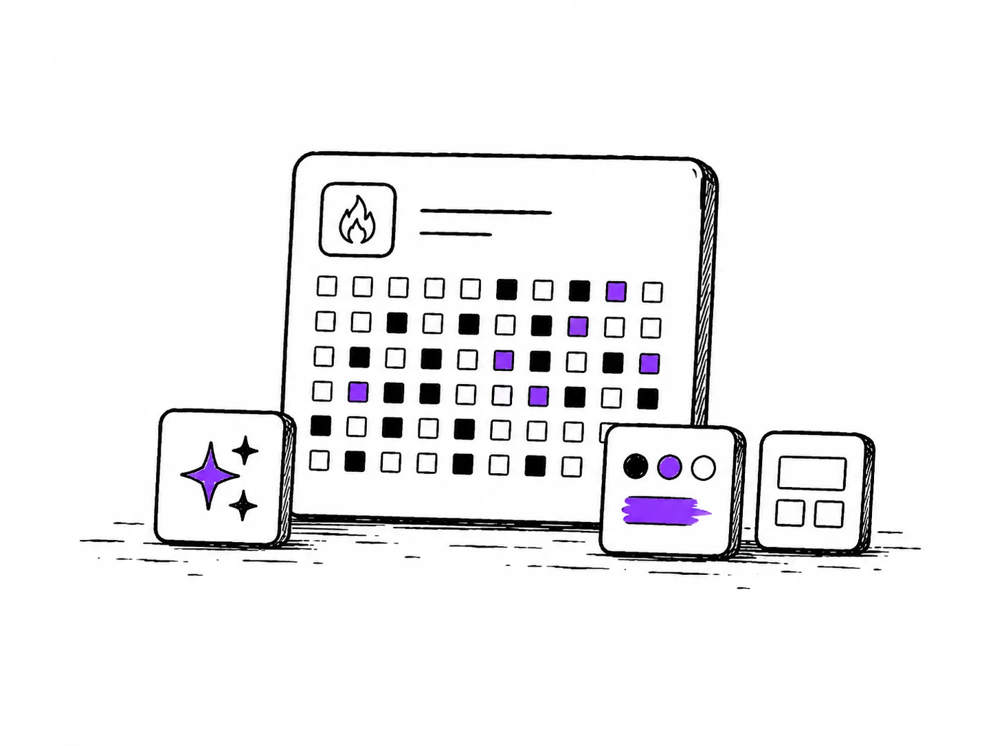
To be honest, I was never fully happy with the HabitHeat logo. The first version of HabitHeat had an orange/red flame logo. It made sense at the time, because the name has “heat” in it and the whole idea was still more connected to fire, streaks, motivation, and visual heatmaps. But over time, the flame started to feel too loud for the kind of product HabitHeat was becoming.
With v2, I moved away from the flame and created a logo that used heatmap cells and a small chart-like shape in orange. It was better than the flame, and it did a better job of explaining the product. It tried to show: this is about habit tracking, heatmaps, patterns, and data.
But it still never felt quite right.
It felt more like a temporary solution than a real brand mark. It explained the product a little too literally, but it did not really capture the feeling I wanted HabitHeat to have.
The more I used HabitHeat myself, the clearer this became. The app itself had become calm and minimal. It had light mode, dark mode, clean cards, heatmaps, analytics, and a very quiet interface. But the website still had this orange SaaS-like energy. The landing page used orange gradients, orange buttons, and the old v2 logo. Then you opened the web app and suddenly almost nothing was orange anymore. The app was mostly black, white, gray, and habit-specific colors.
It felt like two different worlds.
That was probably the main reason I started rethinking the design. It was not just that I wanted a prettier logo or a new color. It was more that HabitHeat as a product had become clearer, but the visual identity had not caught up yet.
Moving away from orange
Orange was the obvious color in the beginning. HabitHeat, heatmaps, fire, streaks, warmth. It all made sense.
But obvious is not always right.
The more I thought about HabitHeat, the less orange felt like the right main color. Orange has a lot of energy. It feels active, warm, fast, motivational, almost like something is burning. That can be great for some products, but HabitHeat is not really about that anymore.
The way I see HabitHeat now is much slower.
Habits are not loud. They are not always exciting. Most of the time, habits are almost boring. You do something small, you come back again, you miss a few days, you return, and slowly a pattern starts to appear. The value is not always visible on the same day. It becomes visible later, when you look back.
That is the feeling I wanted the design to support.
So I started moving away from orange and testing purple as the primary accent color. Purple felt calmer and more reflective. It still gives HabitHeat a recognizable color, but it does not scream for attention. It works well on white, it works well in dark mode, and it connects nicely with the product without making the whole app feel loud.
The new primary color is #7C3AED. It is now used for the main CTA buttons and important action states, while the rest of the interface can stay mostly neutral.

This sounds like a small change, but it makes a big difference. The website and the app now feel much more connected. Before, the landing page looked like one product and the app felt like another. With the new purple accent, the whole HabitHeat experience feels more like one coherent thing.
The new logo
The biggest visual change is the logo.
The old v2 logo was built around the idea of heatmap cells. It tried to communicate HabitHeat directly: cells, data, progress, charts. That was useful in a way, but it also made the logo feel more like an explanation than a symbol.
For the new logo, I wanted something simpler.
I wanted a small mark that could work as an app icon, favicon, header logo, PWA icon, and brand symbol. Something that did not need to explain the whole product. Something that could just feel like HabitHeat.
I ended up with a small block or button-like shape with an H inside it.
The idea is loosely inspired by the simplicity of logos like Notion. I like that kind of object-like logo. It feels like a small tool, not just a flat icon. Of course, I did not want to copy it directly, because HabitHeat needs its own identity. But the general direction made sense to me: simple, recognizable, slightly physical, and flexible enough to work in many places.
For HabitHeat, the little block also fits the product in a subtle way. The app is built around small entries, cells, days, and pieces of data that slowly become a bigger history. The logo does not need to show a full heatmap anymore, but it can still feel like a small piece of something larger.
I am still not 100% sure this logo is final forever. I think the H itself could become more unique over time. Something like the Pinterest P, where the letter itself has a bit more character. But for now, this is by far the best HabitHeat logo I have had so far. It feels simpler, calmer, and more like an actual brand mark.
Updating the typography
I also changed the typography.
Before, HabitHeat used Inter in many places. Inter is a great font, especially for apps and user interfaces. But it also has a very familiar SaaS/product feel. For the new direction, I wanted something that still works well in the web app, with charts, labels, buttons, and numbers, but feels a little more modern and less generic.
I tested a few options and ended up with Geist.
Geist still feels clean and functional, which is important for the app. HabitHeat has a lot of small UI elements, dates, statistics, and labels. The font cannot be too playful or too editorial. But compared to Inter, Geist gives the product a slightly fresher and more intentional feel.
I do not want HabitHeat to become overdesigned. The app should still feel simple and usable. But small choices like typography, button color, spacing, and logo weight add up. Together, they make the product feel more complete.
Rethinking the homepage
The homepage also needed to change.
The old landing page was not bad, but it felt a bit too much like a classic SaaS page. There were CTAs, feature sections, screenshots, stats, and orange gradients. It explained the product, but it did not really communicate the feeling behind HabitHeat.
The new homepage is built more around the idea of visual habit history.
Instead of starting with a long feature pitch, the new hero focuses on the main feeling: seeing your habits grow over time. I also added an interactive heatmap directly into the hero. It is not just a screenshot. You can hover over entries, see details, switch between habit types, and change the color.
That feels much more like HabitHeat.
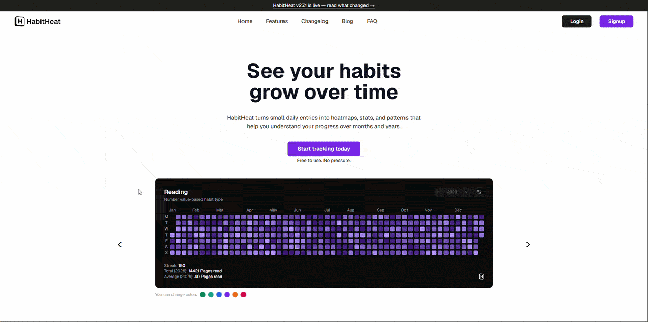
This was one of the most important parts of the redesign for me. HabitHeat is visual. It is about interacting with your habit history. So the homepage should not only tell people what the app does. It should let them feel it immediately.
I also added a live count of habit entries, pulled from the app. Instead of showing a generic trust bar with multiple stats, I wanted one simple line that connects directly to the product:
HabitHeat users have logged thousands of habit entries and counting.
That number is not just social proof. It also fits the whole idea behind the app. Small entries add up. That is literally what HabitHeat is about.
Showing a real habit, not just a mockup
One of my favorite parts of the new homepage is the “Why I built HabitHeat” section.
Instead of using only fake screenshots or polished mockups, I wanted to show my actual meditation habit. This is the habit that has been with me the longest, and it is one of the main reasons HabitHeat exists in the first place.
So I built a private read-only embed that lets me show my real meditation heatmap directly on the homepage. It is loaded from the web app through an iframe, and visitors can explore it without editing anything.
That feels much stronger than a normal screenshot.
It connects the product to the story behind it. HabitHeat started because I wanted to understand my own habits over time, especially meditation. That story is a big part of [why I built HabitHeat] in the first place. Now I can show that history directly on the page.
This is also a small preview of where HabitHeat might go next. Public profiles and habit embeds are not part of v2.8 yet, but this homepage embed is an early internal version of that idea. In the future, I want users to be able to share selected habits publicly, embed them in places like Notion, Obsidian, personal websites, portfolios, or social profiles, and build small public habit histories if they want to.
Everything would be optional and private by default. But I like the idea that habits can become something you can share, not in a competitive way, but as a quiet record of what you keep coming back to.
Making HabitHeat quieter on purpose
A lot of design changes in v2.8 are small on their own.
A new logo. A new primary color. A new font. A new homepage. A better connection between website and app. A more interactive hero. Real habit data instead of only mockups.
But together, they move HabitHeat in a clearer direction.
I want HabitHeat to feel quiet on purpose.
Not boring in a lazy way, but calm in a deliberate way. The product does not need to shout at you. It does not need to make every habit feel dramatic. It does not need to push notifications, streak pressure, or gamified urgency into the center of the experience.
Habits themselves are often slow and quiet. You do not always notice progress while it is happening. You notice it when you look back.
That is what the new design is trying to support.
The old orange direction was more active and more obvious. The new direction is more subtle. It gives HabitHeat a stronger identity without making it louder. It makes the app feel more like a place you can come back to, not a tool that tries to constantly pull you in.
Part of v2.8
This redesign is part of HabitHeat v2.8. I also added a shorter product update to the HabitHeat changelog, but I wanted to use this article to explain the thinking behind the new look in a bit more detail.
I will probably keep improving the logo, homepage, and brand over time. I do not think design is ever truly finished, especially with a product that is still evolving. But this version feels like a big step in the right direction.
The old v2 design was a good transition away from the flame logo and the early HabitHeat look. But v2.8 feels much closer to what I want HabitHeat to become. It feels calmer, more focused, and more like a place where small entries can slowly turn into a visual history.
And honestly, this new look makes me much more excited to keep building it.
Thanks for reading,
Philip